

This typography was custom-designed for the signage of the many viparis lounges, exhibition spaces, and congress areas: porte de versailles, palais des congrès de paris, espace champerret, carrousel du louvre, palais des congrès d’issy, le bourget, villepinte, cnit paris la défense, espace de la grande arche, palais des congrès de versailles.
This font meets the requirements of this use : The letters that compose it are both readable closely and from afar, and its forms are engaged in a lineal utility as identity.
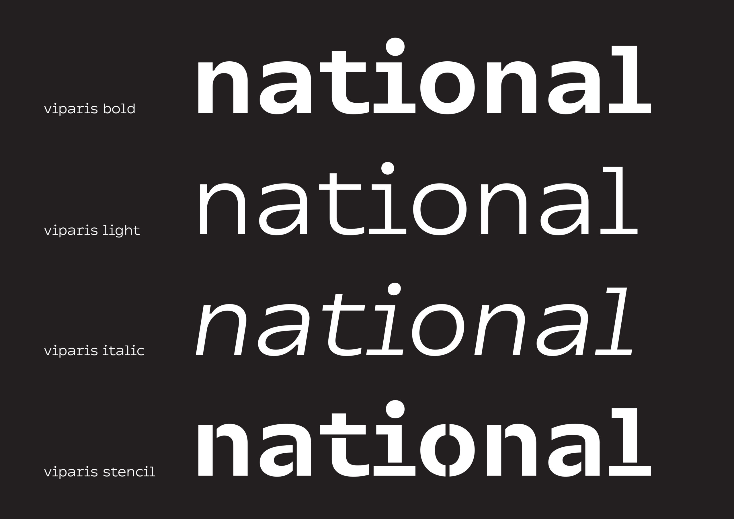
It offers two levels of reading:
– By far a first readable level : synthetic lineal
– Almost a visible level : strong and singular details
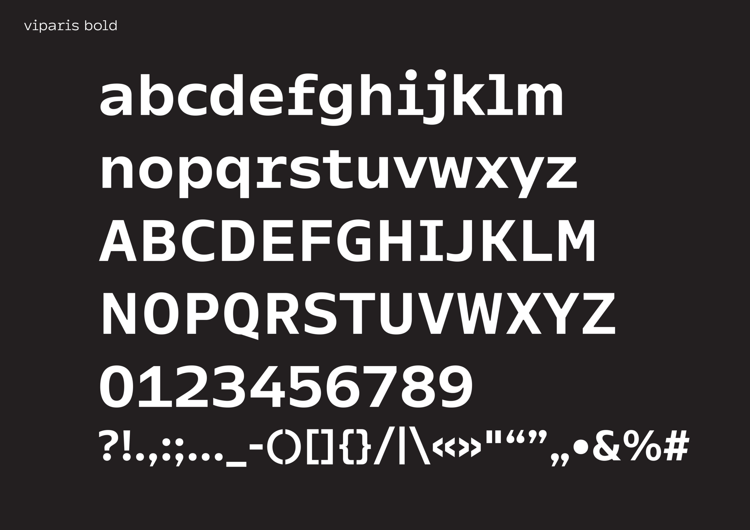
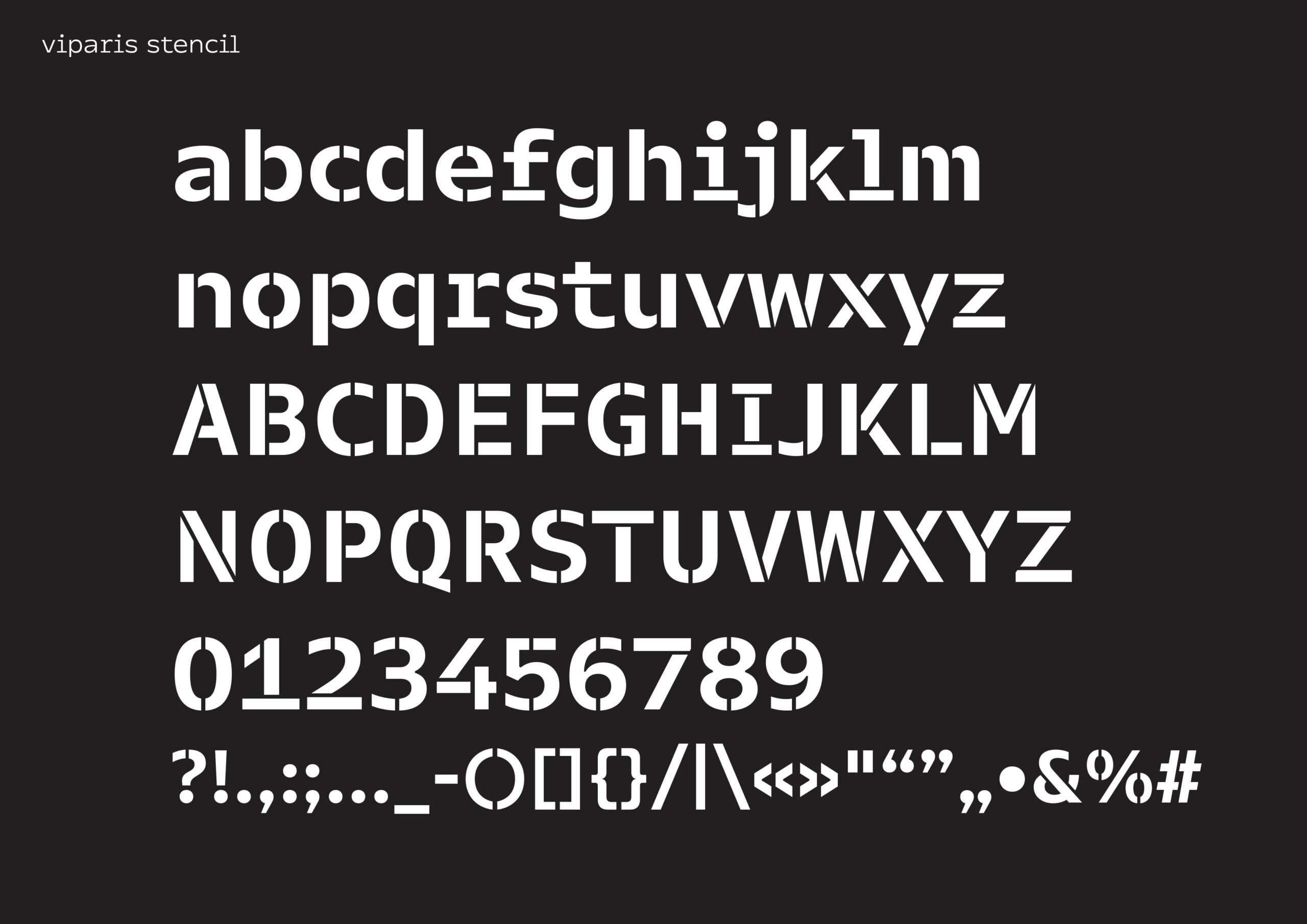
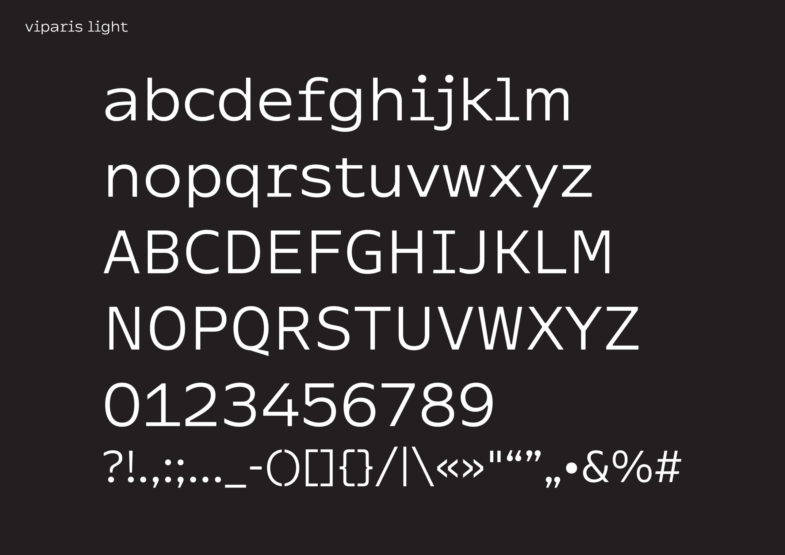
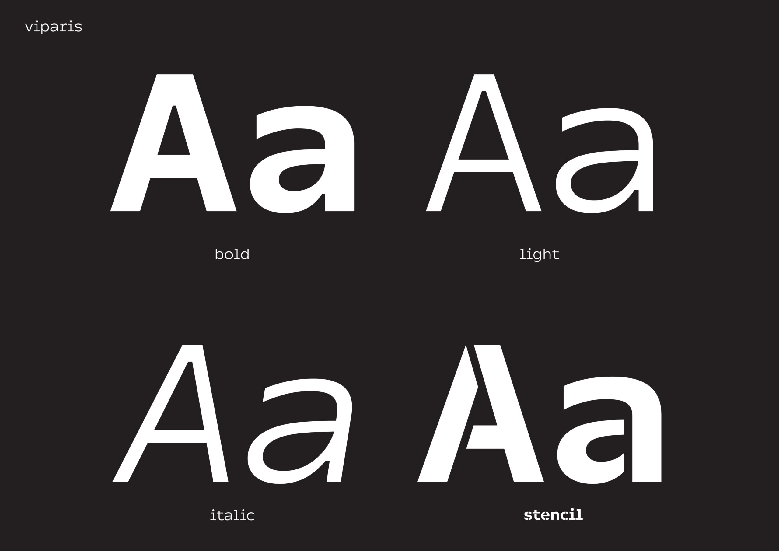
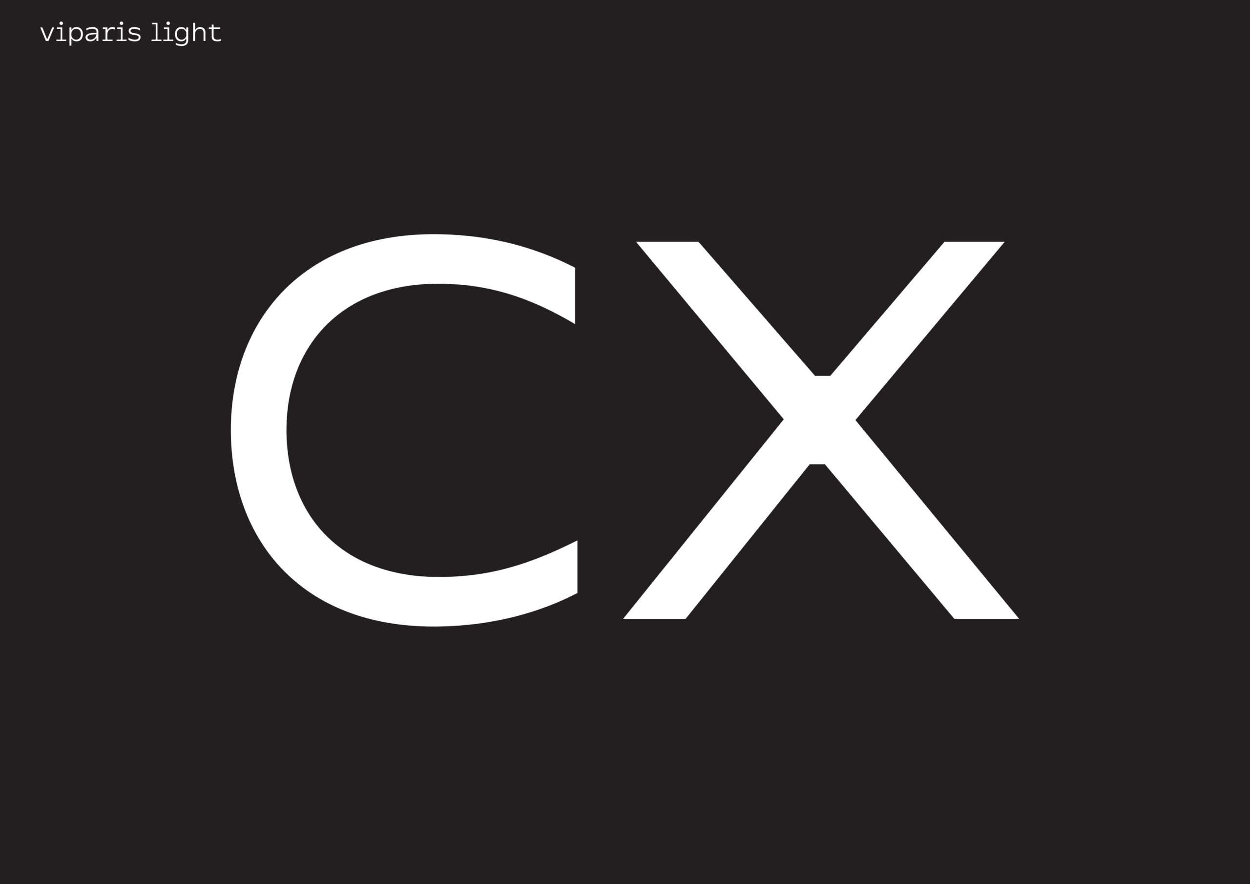
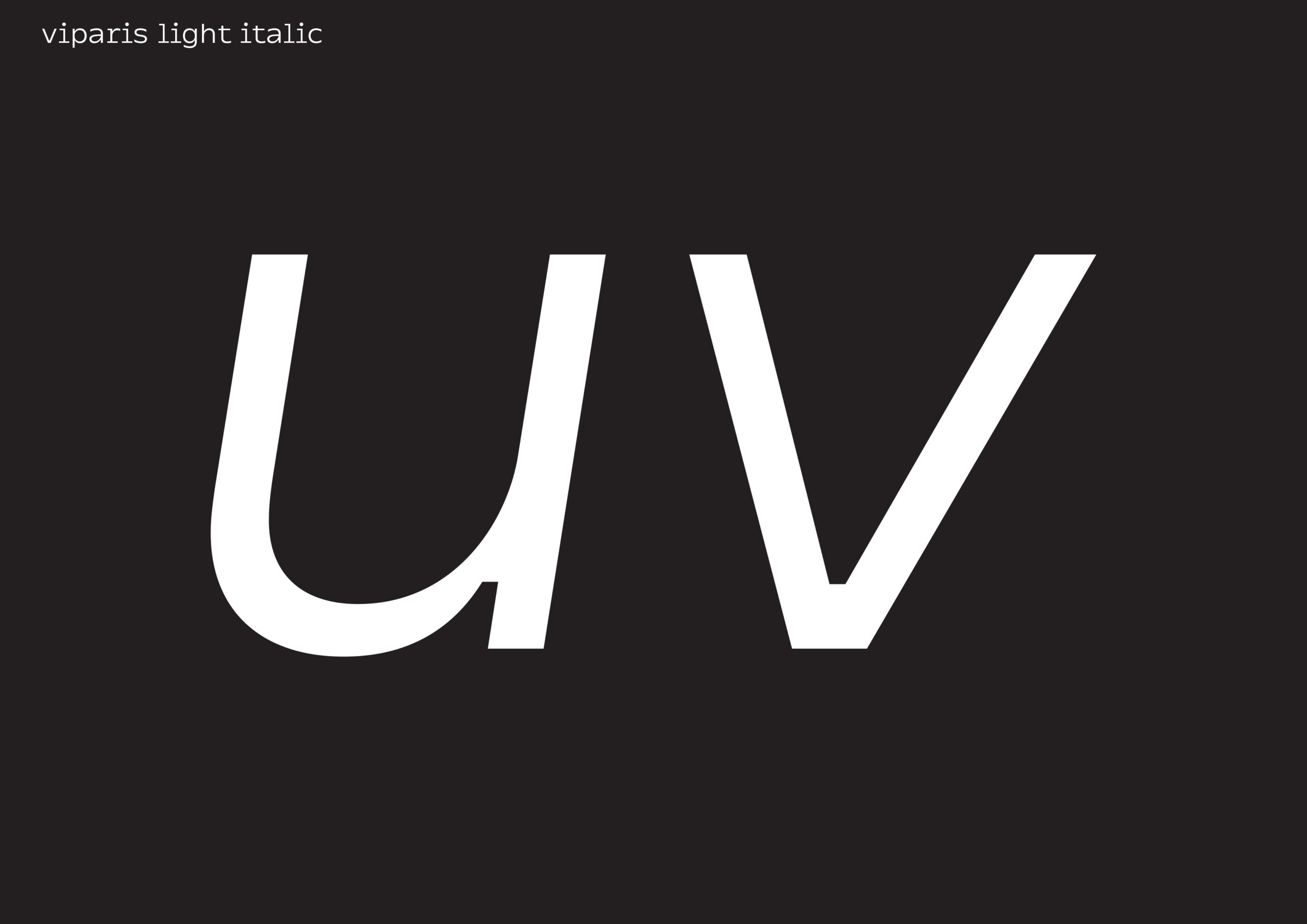
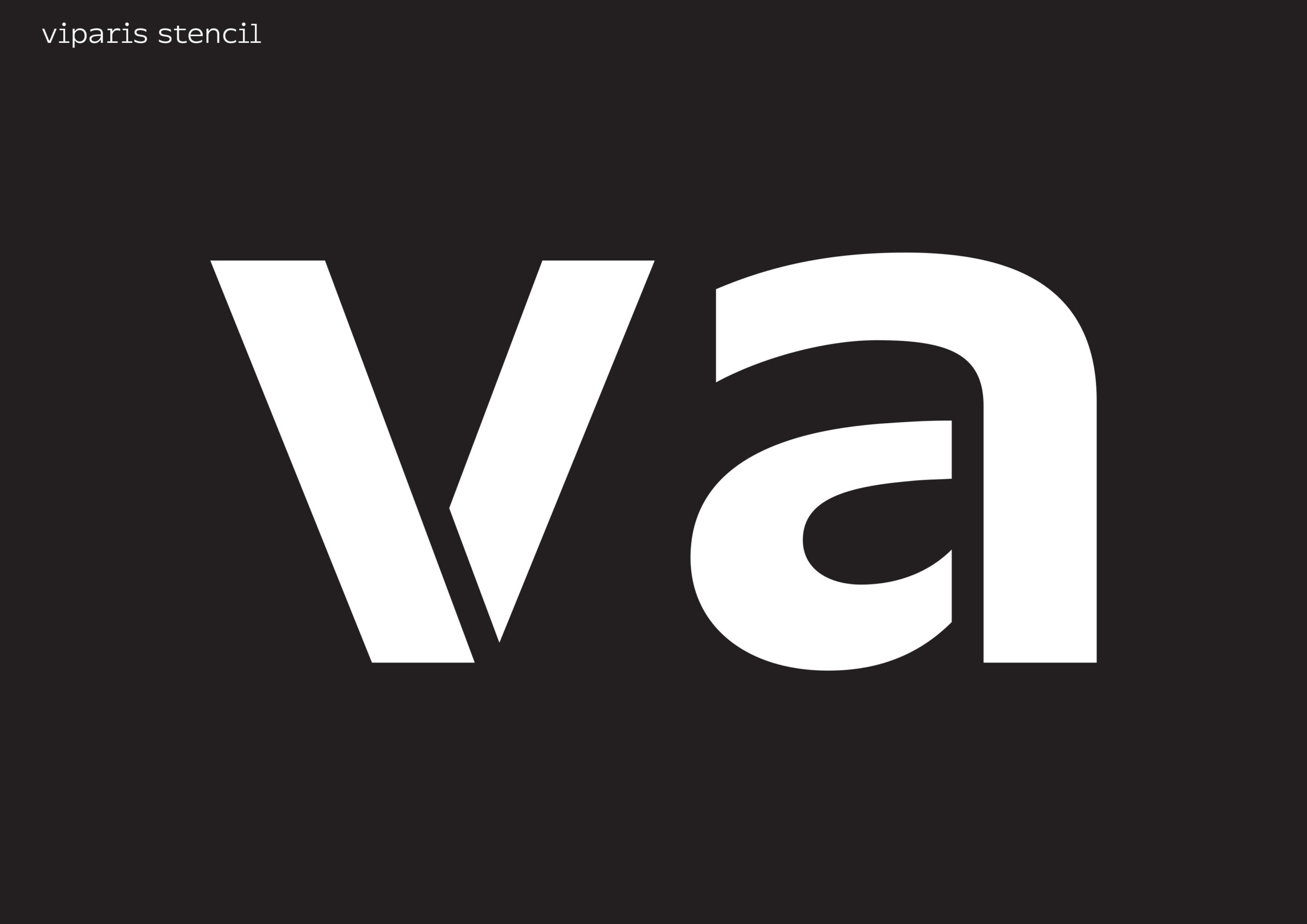
Consisting in a light (English), a bold (French), an italic (secondary information) and a stencil (parking lot stencils) it was designed to meet the needs of multiple reading levels needed to Safety of as different as complex spaces.
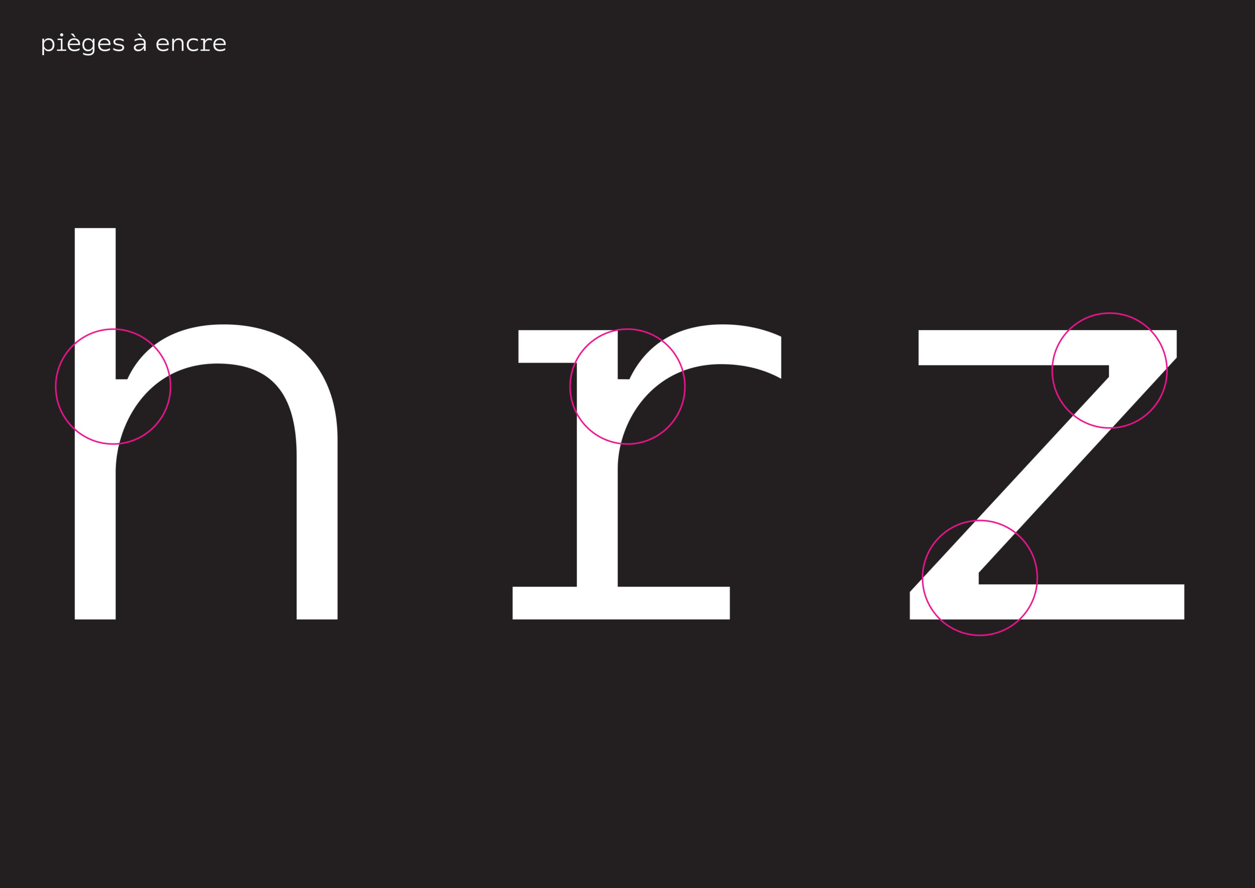
TECHNICAL SPECIFICATIONS :
SHORT-DOWN AND BOTTOM : Great eye level for a significant impact of lower case and readability
CAPITALS AS THE SAME HEIGHT AS THE BOTTOM : Ergonomic composition panels – Simplicity and visual clarity
CASUAL WHEELBASES : Inspired monochasses, they offer greater differentiation of letters between them – endings « open » the making it readable typography great as in small bodyfont
INK TRAPS : Offer two different visions of the same typography – From a distance, or small bodytext: they do not see themselves, and allow connections only « clog » not – Viewed up close, or large bodytext: they give the typography a wealth of detail, and a real feature